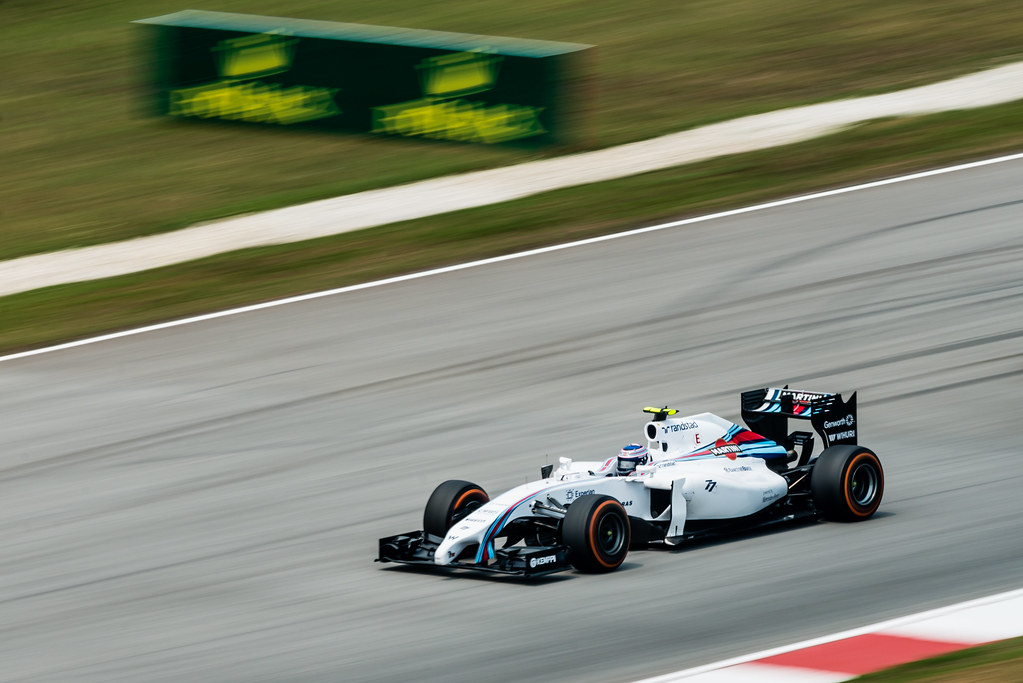
The start of the 2014 Formula 1 season brought expectation and excitement. It also introduced a very cool new car design from Williams Formula 1 FW36, with a Martini inspired livery.
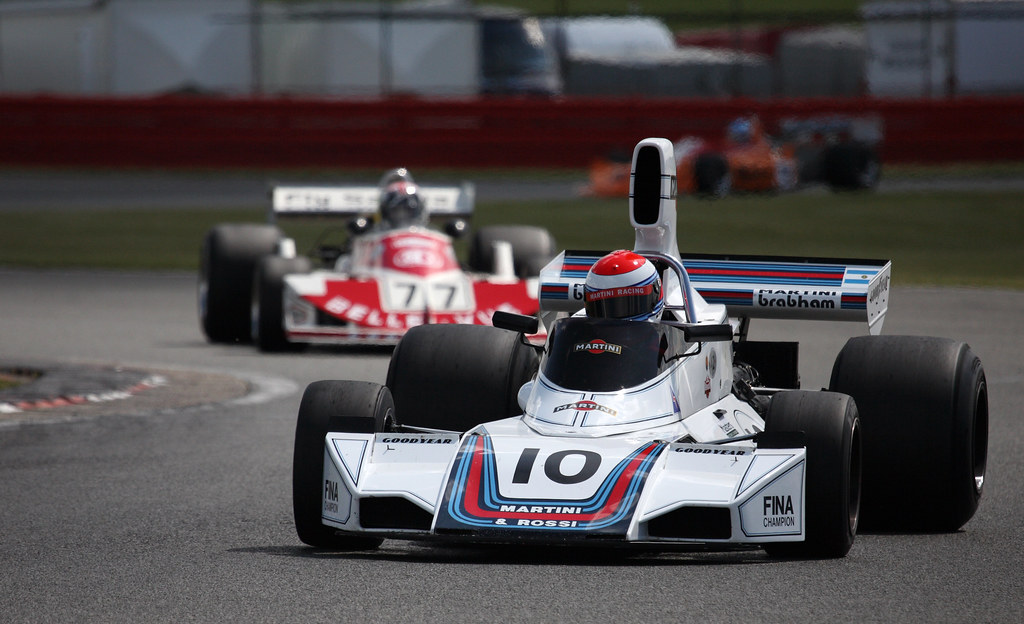
It’s a tip of the hat to motor racing history and a time of classic design. Here’s the Brabham BT42 from 30 years ago.
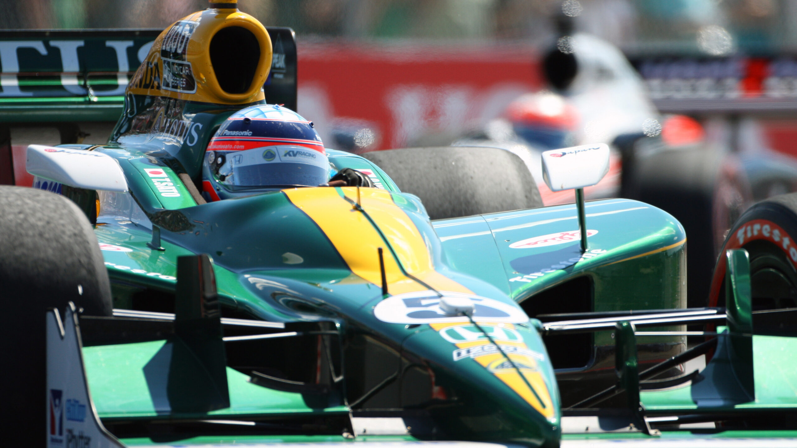
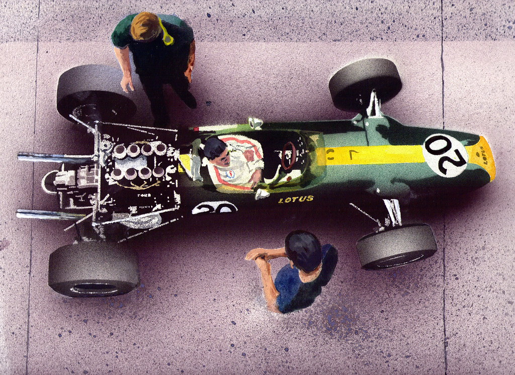
It got me thinking about race car livery design and the way stripes have played a pivotal role in creative inspiration. There are so many great examples but it’s hard not to immediately consider Lotus.
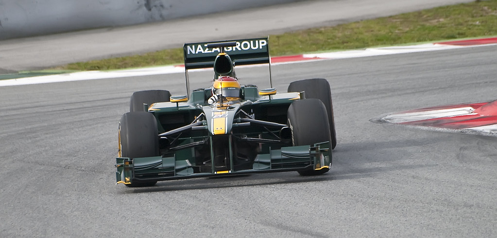
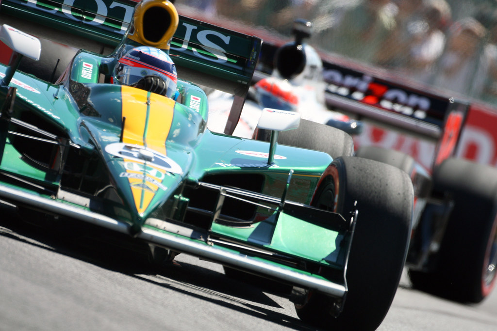
Lotus, both historically and with the revamp in recent years has been a leader in iconic, timeless design. Check out this combo from history to recent F1 and even IndyCar.
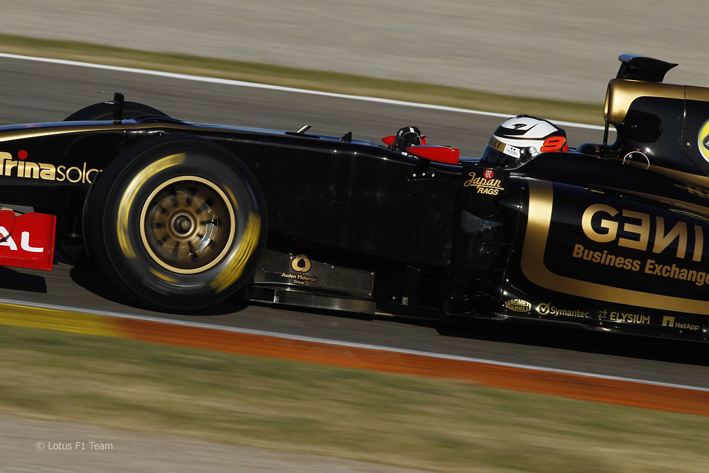
Lotus own more than just the classic green and yellow combo. They also know a thing to two about black and gold – again utilizing a simple line or two. Check out Kimi Raikkonen in action during the 2012 season.
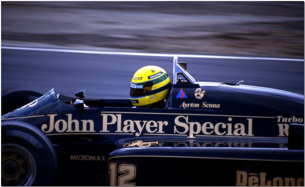
Now check out a young Ayrton Senna in action at Brands Hatch in 1986.
Such an timeless look that shows the power of a simple line on a race car design.
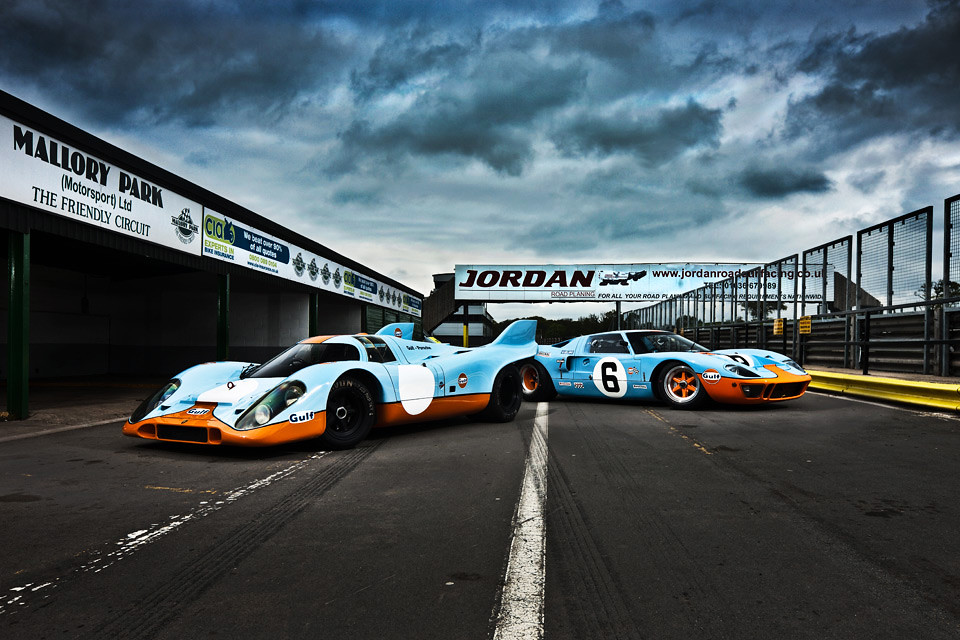
A couple of years ago, Jalopnik published a piece called The Ten Coolest Racing Paint Schemes of All Time – great read if you haven’t seen it. It covers all areas racing, and although I’m keeping most of my examples to open wheel competition, I feel compelled to mention the beautiful Gulf Blue/Orange Ford GT40. How’s this for a double dose? A Porsche 917 and Ford GT40 in the blue and orange combination.
Back to F1 (and I’m biased since my father worked for Brabham in 1983) but I am a huge fan of the Brabham BT52 driven by Nelson Piquet and Ricardo Patrese. A beautiful use of lines with blue and white, and of course, BMW turbo power.
This inspiration continued on in future seasons and I loved the Olivetti sponsored design from Brabham, even if the performance of the car let them down.
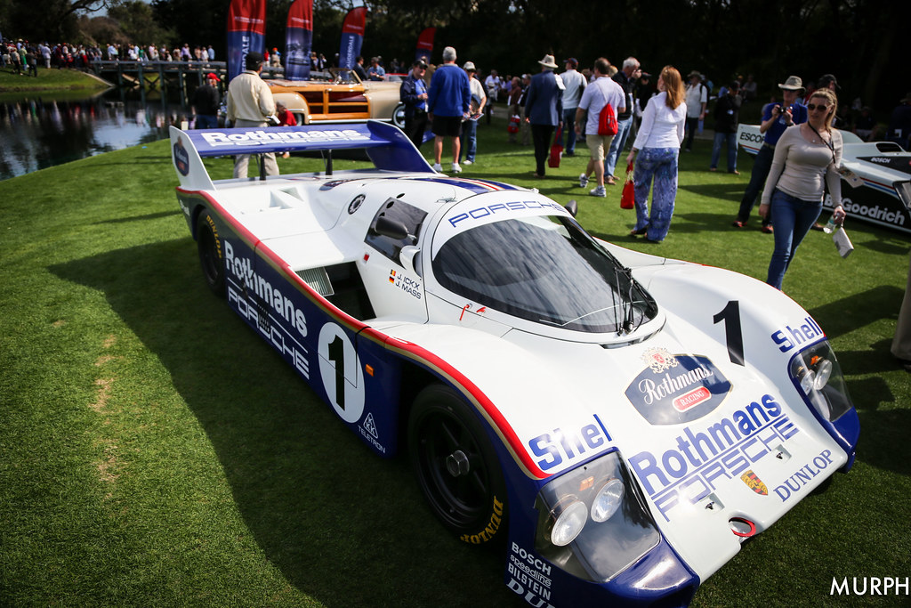
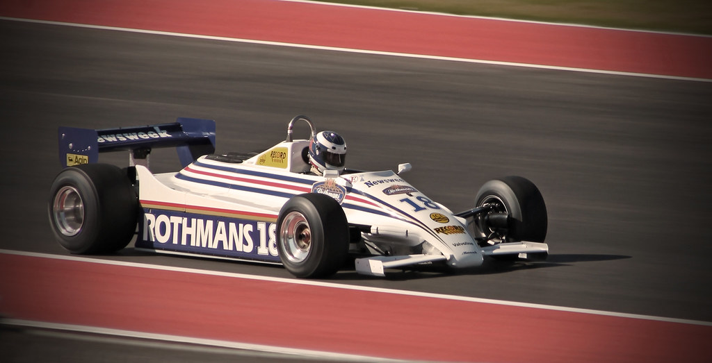
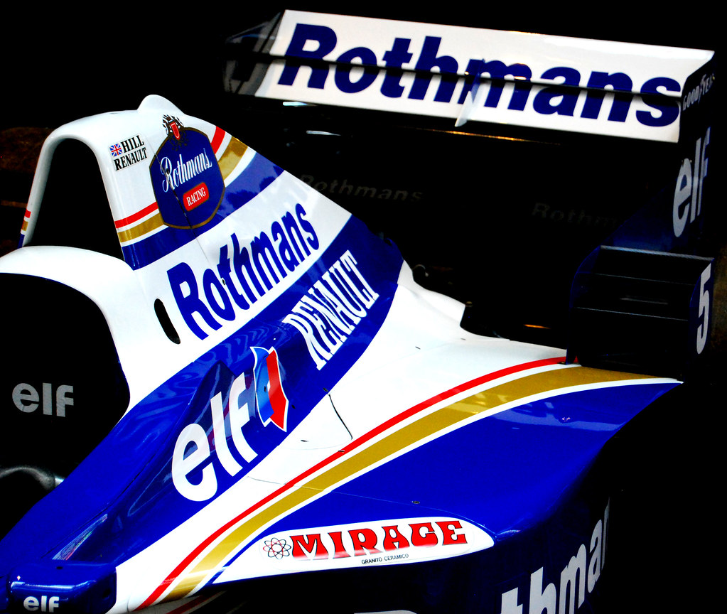
From Olivetti to Rothmans, it’s hard not to notice the enduring classiness of their cars from to Sports Cars to F1.
Now to jump all over the place with some honorable mentions.
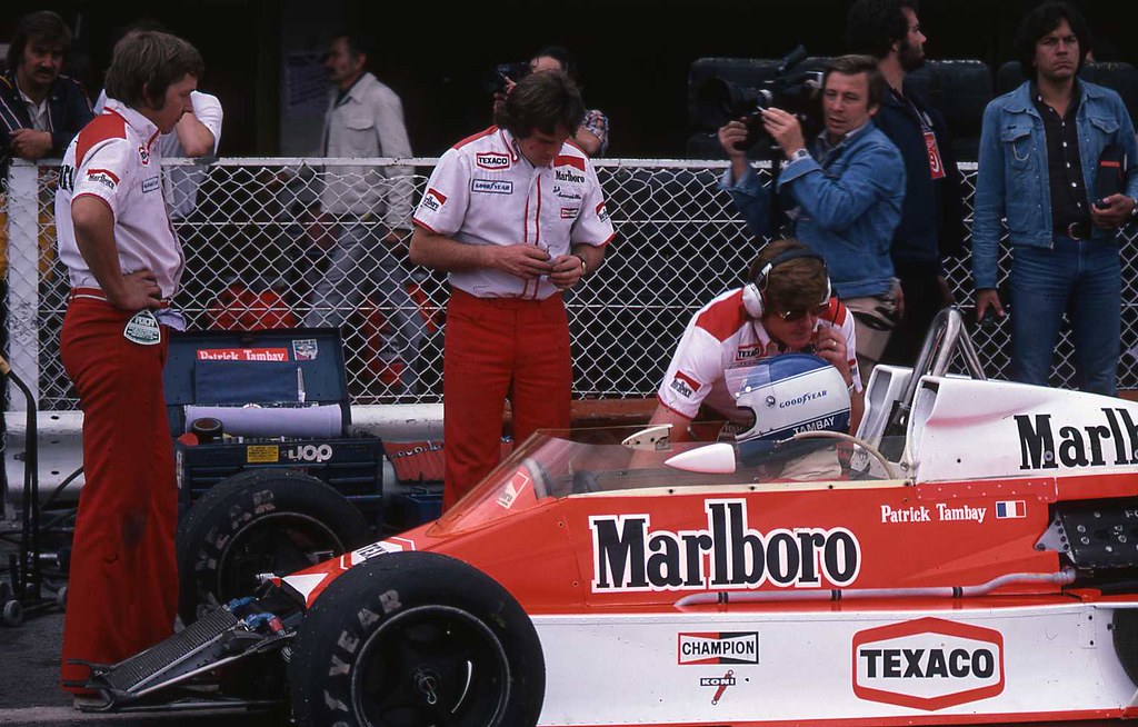
How about McLaren during the Marlboro years?
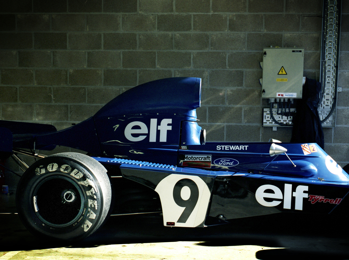
Or the simplicity of Elf and Tyrell?
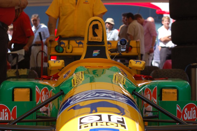
The Bennetton years? (excuse the tiny photo).
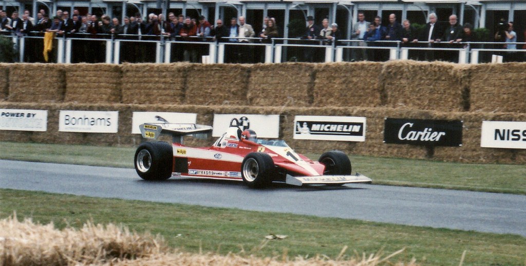
Or a Ferrari driven by Jacques Villeneuve featuring both Fiat and Agip?
I’m amazed how good design can stand the test of time. That’s applicable to any industry, but some of the examples above are still relevant today. The new Williams is a testament to this.
This could be an endless list – so I am going to stop here and wait for your opinions and suggestions. I’ll continue to add to this post as feedback comes in. All images featured in the post are from Flickr from users that allow embeds. Thank you for reading, I’m looking forward to your responses.
END: April 12, 2014.



Recent Comments